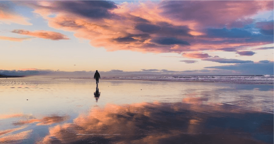
Alex Stuart is a 26 year old freelance videographer/photographer from New Zealand. He is currently living in Christchurch in the South Island which is an awesome spot for outdoor adventures/ landscape photography. His links are @alexstuartnz on Instagram and @asmedianz on Facebook.
Getting Your Signature Logo:
Hiring a calligrapher: once a pricey option (think $500+), can now be yours for just $39! Get yours crafted by a pro calligrapher in 2-3 days. Below are some examples from our studio. Click here to get your unique Signature Logo.


I changed my life, starting from scratch
I first picked up a camera about 3 years ago now. I decided to do this because of my interest in adventuring and the outdoors. I really wanted to be able to do the places I was visiting justice photographically. So one day I went out and bought myself a Sony a6300. I took a sick day off work the next day and spent the whole 8 hours reading the manual and figuring out how to use a proper camera. I had no previous training in photography and had no idea what f/stop/ISO/ all of that stuff meant! It really was starting from scratch.
Currently my job is freelancing making videos and taking photos. I decided to leave the corporate world as I was driving myself nuts sitting behind a desk all day. After 3 months in China on a work project early 2018 I decided to come back and see how long I could survive by freelancing. 9 months later I’m still going which is cool! I love the freedom and challenge of working for myself.
What’s a composite image?
A composite image is basically where you combine two or more images together to create a new one! Normally this is done using Adobe Photoshop + Lightroom. I think this is a really cool genre of photography as I see it as mixing traditional art like painting with photography. You are trying to create your vision of what you have photographed by using digital tools instead of physical ones. There are so many different ways of doing composite photography, the possibilities are endless which I think is exciting.
Getting a natural look
I think that everyone when they start out with photography suffers from the ‘over edit’ habit. I was guilty of using too much saturation/ clarity/ colouring in my images. Over time I learned to dial back my adjustments and that made a more natural looking photo. I also learned not to be impatient with getting the photo out there, walk away for a break then come back to the screen with a fresh pair of eyes. Its easy to get stuck with tunnel vision when you’re editing!
It really is just lots of practise which helps you train that eye. Also watching lots of other people editing on Youtube was a big help as you get to see the logic behind how they manipulate the images.
Let’s take a look together to the 5 fundamental steps to create a good composite:
1. Use a Tripod
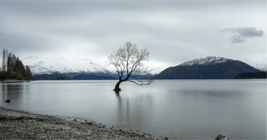
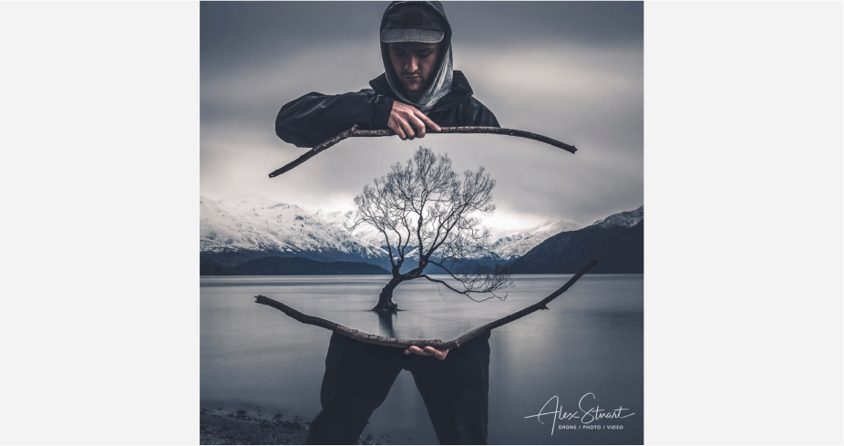
This will save you so much time in the editing phase! When you take a composite you want your photo to be sharp and crisp! This makes it easier for the editing software (and you) to mask out the lines. Your photos will match in terms of perspective and horizon. This saves you less mucking around in the editing stage. If you can’t use a tripod then make sure you use your shutter speed at a level above 1/300 to avoid camera shake blurring your image. See the two images below are lined up almost exactly from shooting on a tripod so when I combined them it was nice and simple.
2. Think about your image
Think about how you are going to construct your composite before you shoot it. What are you going to have to mask off? Are you going to have a complex shape to mask (such as persons flowing hair) or hard lines like the filter I’m holding in the photo below. Hard lines are easier to mask out as opposed to blurry complex shapes. Your background can also make a big difference on how easy it is to mask a subject. Simple monotone backgrounds are easier than complex, colourful ones.
3. Match your perspective
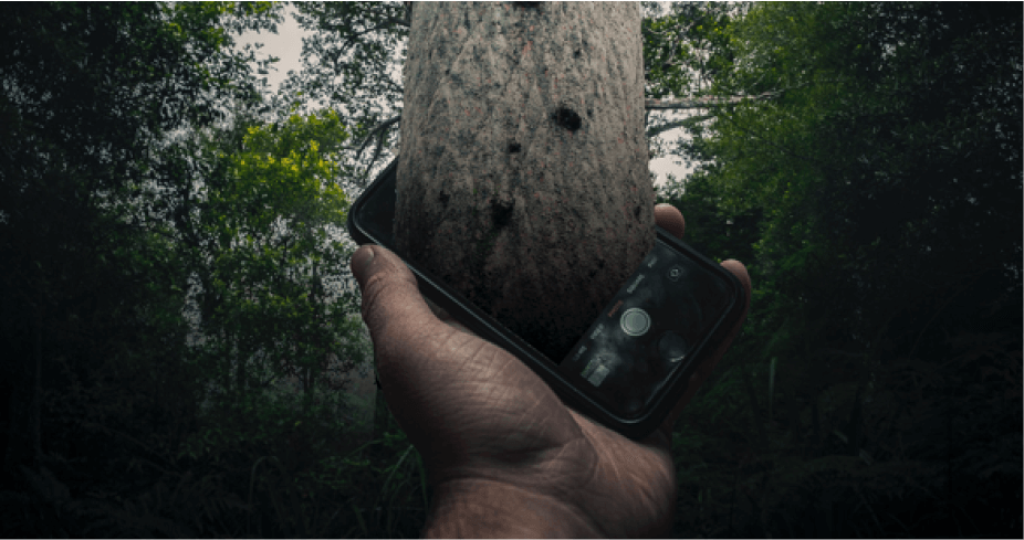
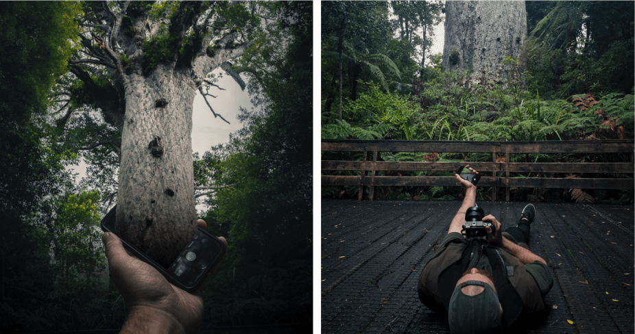
This is pretty standard. Giant tennis balls rolling down a road obviously don’t look realisitic. This may be what you’re going for however. Things that are close are bigger and sharper, further away are smaller/ blurrier. If you look at this photo below I took of Tane Mahuta, a giant Kauri tree in New Zealand. I took several photos of my holding the cellphone in different planes/perspectives so that I could select the one which looked the most natural when it came to editing.
4. Match your lighting/ colours.
First of all when you shoot, try and shoot so that your lighting and colours will work in harmony. For example if you shoot the subject in the morning with the sun coming from the right side, and then shoot the background at sunset with the sun coming from the left. This will look super weird. I try and shoot so that my photos are going to match up in terms of lighting and colour balance. Then I add the creativity in post.
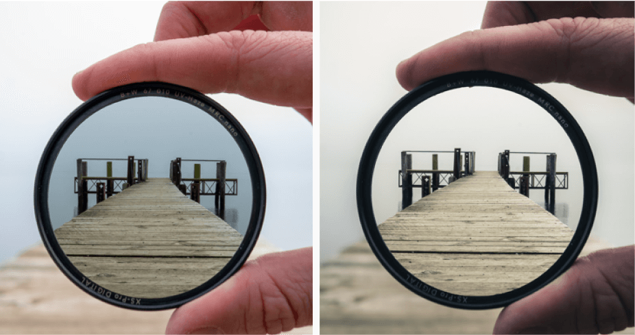
With regards to your workflow it pays to match up your light/white/colour balancing on each individual image in lightroom before you make your composite over in Photoshop. You want them to line up from the start as it is much more difficult to correct them when they are merged together in lightroom at the end! See below images for example
5. Use good image editing software
It pays to start off by using good software. Photoshop and Lightroom by Adobe make this process so easy because of how seamlessly they work together. You can colour correct your two original photos in lightroom then hop over to photoshop to mask off your composite then hop back into lightroom again to do your final creative touches.
See images below for the workflow.
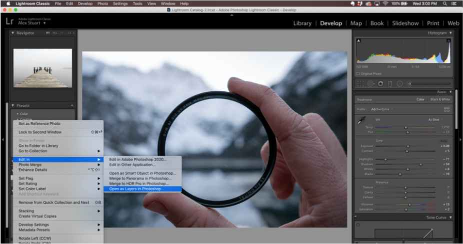
a) Colour correct individual images in lightroom. Once you have done this select both then right click, edit in, layers in photoshop. See below image.
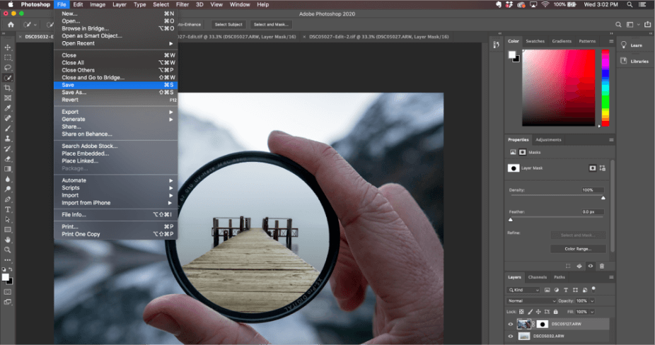
b) This will open your images as two layers in Photoshop. Do your masking/manipulation in Photoshop then file>save. This will send your composite back to your Lightroom library ready for final editing.
c) Go back to Lightroom and make your final creative touches to your composite. This part is up to you and your style. Do what you think looks cool! The more you work at it the more you will develop.
Developing your own identity
Developing my style was something I found so frustrating. Everyone in the beginning always talks about it but I had no idea how to do it! I thought I didn’t have one for a long time. But the way you figure it out is 3 fold.
1. Watch lots of Youtube tutorials on different editing styles/ look at other artists pictures for inspiration. See what’s out there!
2. Try and recreate other photographers styles that inspire you and apply it to your own projects, experiment and try them all, note which ones you have the most fun with/ are the most satisfying.
3. Shoot lots and reflect! The more you practise the more you can look back on your feed and start to notice patterns in your shooting/editing.
Bonus tip: I also helped understand my own style by going over old edits and redoing them! You really get to see how your style has changed over time. It can be quite a relieving/ cringe experience all at the same time.
The importance of having a Photologo
I started to see my photos being reposted all over the internet, some without any credit attached. I hadn’t given thought to watermarking before then but when something you’ve created gets attention it feels nice to get the credit for it! I also wanted to brand myself as a creator and I liked the sophisticated feel my Photologo provides.
I discovered Photologo through the Facebook ads. I saw one flash by and then made the connection between that and how many creators I had seen using them too. After that I thought well I better get myself one of them.
I really do like the engagement that comes with the Photologo Community. Everybody is active in the group and you get to see lots of constructive feedback going on. Its really cool to see!
Final advice
Don’t stress too much about whether you think your photo is perfectly executed. Just post it! It’ll get you practising and often my most liked pics are the ones I dont’ really think much of! That way you get to see what people like and you may notice things about your work that you were blind to before.
Getting Your Signature Logo:
Hiring a calligrapher: once a pricey option (think $500+), can now be yours for just $39! Get yours crafted by a pro calligrapher in 2-3 days. Below are some examples from our studio. Click here to get your unique Signature Logo.
