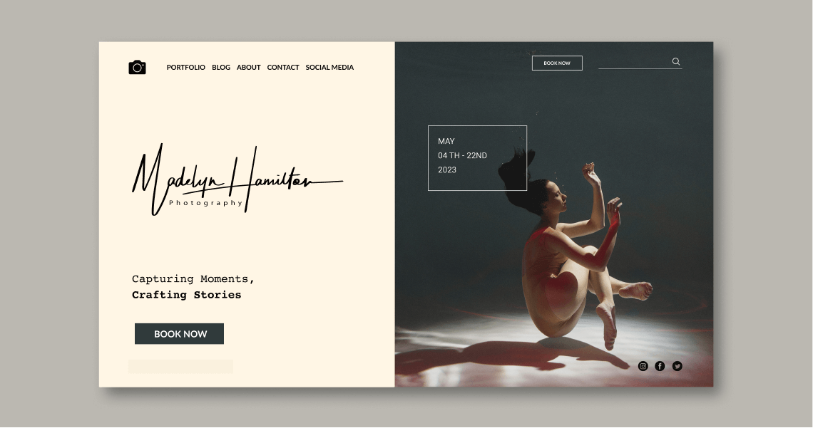
A portfolio website is essential in order to build a photography business. It’s your visual representation, showing off your best work & letting your potential customers get to know you as a person. What are the steps you should follow to build the perfect portfolio?
Getting Your Signature Logo:
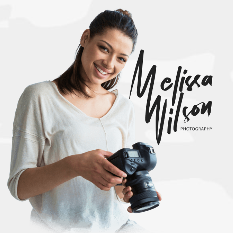
Hiring a calligrapher: once a pricey option (think $500+), can now be yours for just $39! Get yours crafted by a pro calligrapher in 2-3 days. Below are some examples from our studio. Click here to get your unique Signature Logo.


1. Define your purpose
There are many reasons for building a portfolio website. Do you want to put just a bit of your work out there? Or rather build an engaging platform? Maybe combine your portfolio with a blog? Think about how much time you want to invest and what are the benefits you want to get out of it.
2. Get inspired
Stuck on the layout? No worries! You’re probably not the first one going through this. There is no shame in researching how the websites of your favorite photographers look like: try to go through as many as you can, observing what you admire and what you want to avoid. Don’t forget to write your observations down on paper and divide them into “yes” and “no” columns so you can apply those to your own portfolio.
If designing a website isn’t for you, then there are thousands of online templates available and website builders that allow you to easily create yours for free and try your hand at it before you decide to stick with it!
3. Be user experience friendly
The first moments on your website are crucial. Almost as soon as people click, they immediately decide whether it’s time to explore it or move somewhere else.
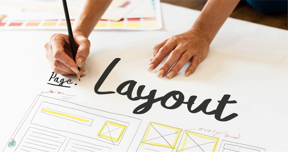
Before you start building your website, sketch a basic layout on a piece of paper. Keep it simple and well structured. You don’t want your visitors to get overwhelmed by not figuring out where to find what they’re looking for! A minimalistic approach and modern design will make it easier to navigate and draws more attention to your photos, so keep it easy on the eyes.
Remember, there are many online website builders and surely there is one perfect for you! It depends on your expectations, level of skill and budget.
Some photographers use Squarespace or Wix, since it creates beautiful templates within seconds and doesn’t require any programming knowledge, just intuition. However, if you prefer more freedom – maybe WordPress is the right place to start.
Do your research and find which platform best suits you.
4. Stay consistent in style
Your portfolio and website should highlight your branding; therefore, your layout should complement your style. Keep the visual consistent – colors, fonts, icons, your watermark, and of course, your photos. Focusing on these details will make you look more polished and professional. On a website, everything should have its place and reason.
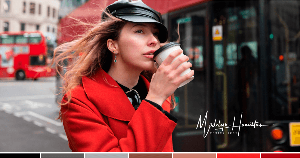
Figuring out what colors represent your work is tough – but once you find the perfect combination you have something to build on! Think about what presets you use for your photography. Do you prefer pastel or soft, faded colors? Or are you more into darker and sober tones? How do the colors look like next to your photos? Do they complement them?
5. Focus on your strengths
Are you a great story-teller? Turn your portfolio into a blog! Yes, sometimes a picture can express more than thousands of words – but adding a story behind it makes it spark. Or do you have a background in graphic design? Use your image-editing skills to differentiate yourself from other photographers. Maybe you love climbing? Share your adventures.
You never know what could draw the attention of your potential customers and make them remember you. There are so many things that are unique about you, so use them to your advantage.
6. Quality over quantity
Keeping a portfolio or a blog updated is a tough task. Find the right balance between quality – sharing only your best work, and quantity – updating your content regularly, so potential clients know you’re open for business. In general, post when you feel like it, but don’t forget to.
Always choose photographs for your portfolio wisely: they are the representation of your work and your own piece of the universe. Try choosing the best 10 pictures of your shoot and look at them in different orders. Evokes different feelings, right?
You have creative control so experiment and try to convey different types of emotions, narratives, and moods within your body of work.
7. Don’t miss those!
All in all, there are some sections of a website which are crucial for your future success – so don’t overlook them. Here’s a quick checklist:
- Portfolio – Displaying your photography is the main reason to build a portfolio website. Choose a template that matches your vision.
- Blog – Try including multiple photos from the same photoshoot in an article. Give your potential customers a glimpse of how much fun they’ll have by spending a day out shooting with you.
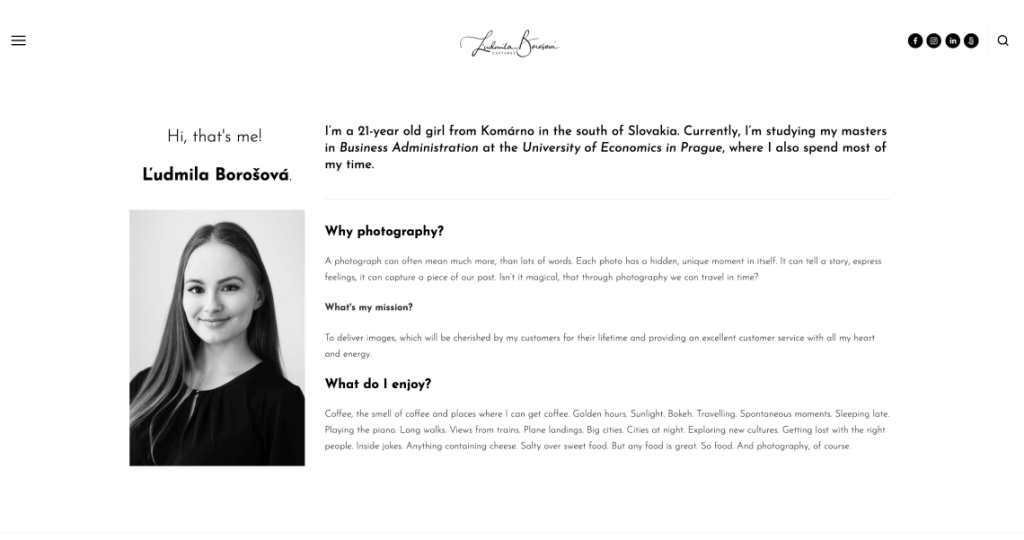
- About – Include a page dedicated to introduce yourself and let your personality come across. You can use a self-portrait to make it look even more professional!
- Contact – People love your work! That’s great! Now, make sure your contact information is visible and updated, so they can easily get in touch with you.
- Social Media – Some visitors are not yet ready to book a session. But it’s important to realize, they might be in the future! Link them to your social media so they keep you in mind.
8. Ask for feedback
Looking at the same thing over and over again might get your perception stuck, so ask others to offer a fresh point of view. Don’t be afraid to ask friends, fellow photographers, or even clients what is their favorite thing about your website or what they, on the other hand, would change.
You’re now ready to start your portfolio website adventure! Take your time and think it over. It’s much easier when you start with a solid objective in mind! And don’t worry – it’s a learning and ongoing process, so you’ll get better on the way by making small improvements.
I’m sure that you’re going to succeed when you stick to your unique vibe and spark it up by putting a bit of yourself into it. People love when they can relate with the person behind the photos, so stick to the tips but don’t forget to be yourself. In the end, it’s much more than an online representation of your work you’re building. It’s an extended version of you, so make the best out of it.
Getting Your Signature Logo:
Hiring a calligrapher: once a pricey option (think $500+), can now be yours for just $39! Get yours crafted by a pro calligrapher in 2-3 days. Below are some examples from our studio. Click here to get your unique Signature Logo.

