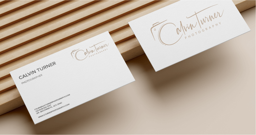
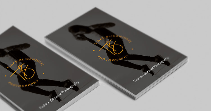
Photography business cards still have their place in the world. As social handles and websites have become commonplace, business cards continue to bring with them a sense of sophistication, especially when made with care and quality in mind.
Why Photography Business Cards Are Important
If you’re building your brand and client base, then you’re going to be doing a lot of networking. While you’ll do much of that on online, they’ll often be times where you need to build contacts in real life. At photography, press, and media events; every conversation you have becomes a pitch. You’re there to grow your business and effectively sell your product – which is your photography. Gaining people’s attention through charm and effective communication is excellent, but you must ensure the conversation continues once they are back at their desks.
A well-designed, quality business card will undoubtedly contribute to you making a lasting impression. After a networking event, people come home with a smartphone filled with plenty of photographers and creatives. A photography business card will make you stand out from that pack.
Getting Your Signature Logo:
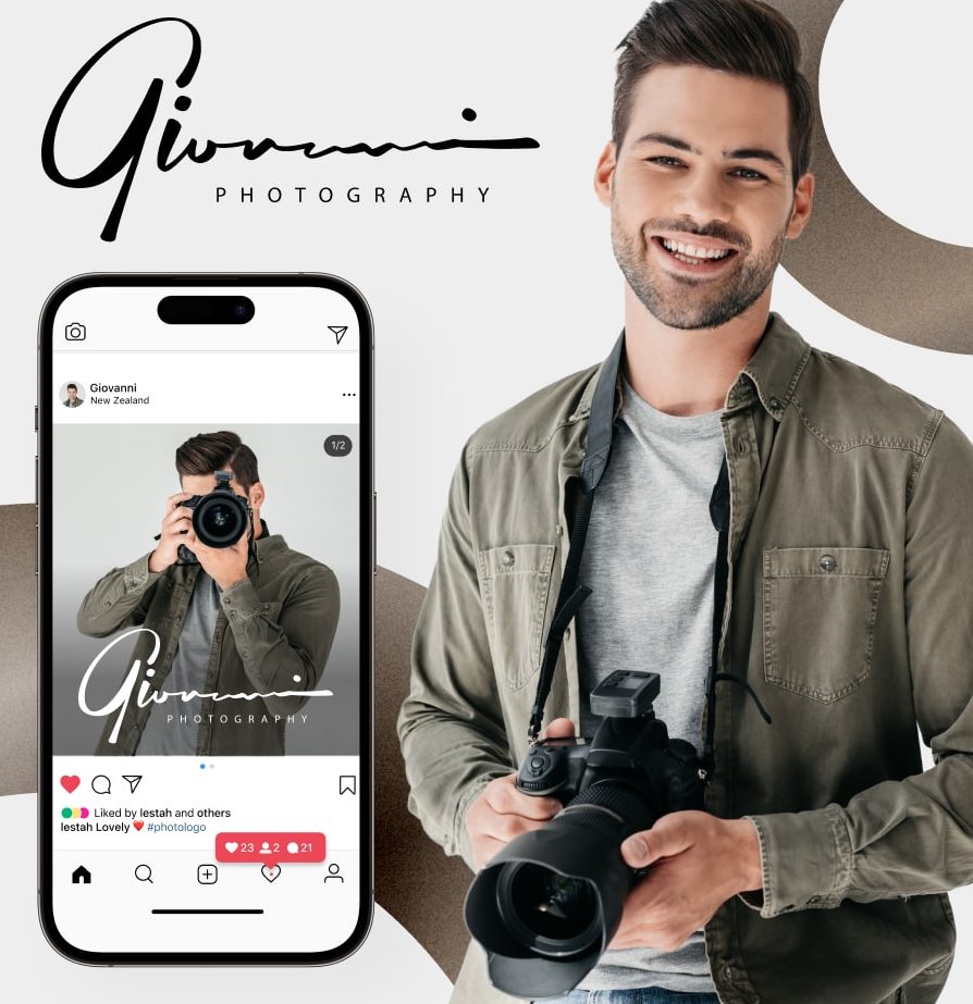
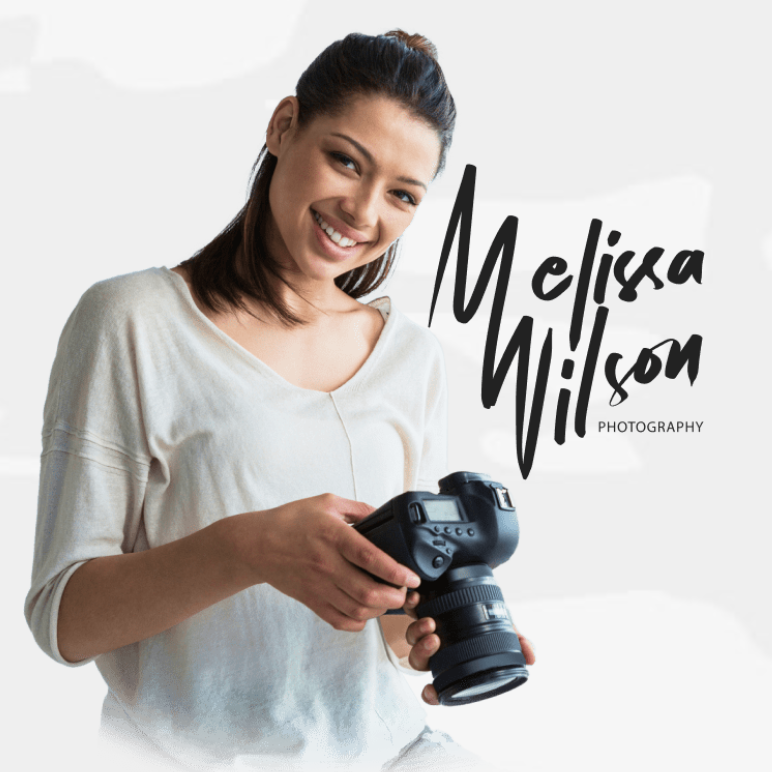
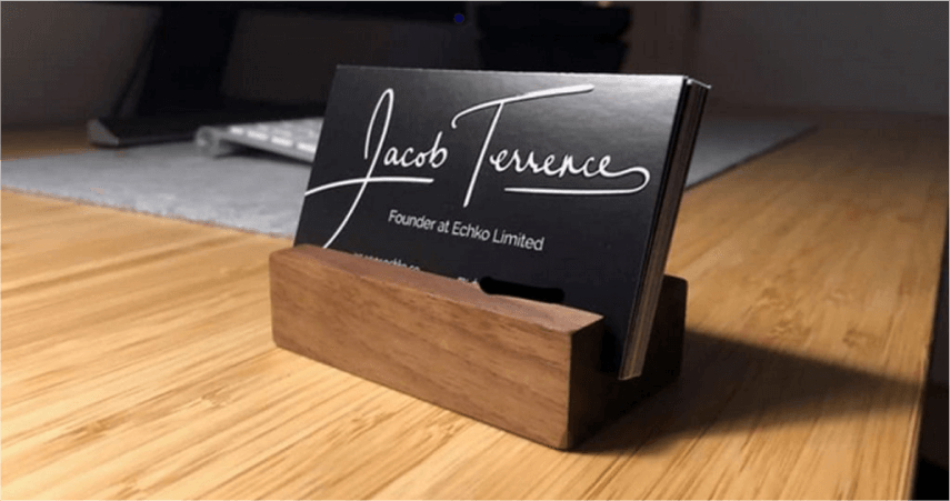
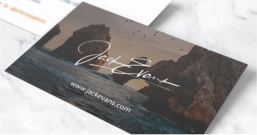
Hiring a calligrapher: once a pricey option (think $500+), can now be yours for just $39! Get yours crafted by a pro calligrapher in 2-3 days. Below are some examples from our studio. Click here to get your unique Signature Logo.


When it comes to supporting you with creating a business card, well, that’s where we come in.
If you’re a little stuck with getting started, here are some things you will want to consider during the design of your photography business card.
Photography Business Card Design
A business card isn’t just a place to hold your contact information. As with each element of your branding, it’s an opportunity to say something about who you are. The layout is extremely important. You must strategically think about where you place each detail and how it adds to the overall design. A card that has too much information, tightly packed together, is not going to be easy on the eye. It suggests that your attention to detail is lacking; this is not a good look for any photographer.
In contrast, a clean, minimalist design, that only has the essential details, shows you’re aware of your image. It creates a positive reaction within the people that receive your card.
On the topic of relevant information, here are the essentials to have on every card.
1. Name and Job Title: A little obvious, but we’ve seen too many examples of photographs omitting this kind of information for us not to mention it. Your name helps people connect to you and on a deeper level. And your job title will outline exactly what service you provide.
Make sure you make it clear what genre you specialize in. Instead of “John Smith – Photographer,” write, “John Smith – Wedding & Portrait Photographer.” Little details like this make a huge difference when it comes to getting hired!
Photologo: Having your name in text is important. But having your logo on your photography business hard brings your design to life. Placing it on the opposite side of your details helps it to stand out, while not overpowering the information people need to know. If you don’t currently have a Photologo, you can easily get one by placing your order here.
2. Email and Telephone Number: In all cases, you must have your email and telephone number on your card. They’re still a popular method of communication, especially for business enquires. So having them will prevent people from having to go through your social and website to find out how to contact you. Or even worse, not bothering at all!
3. Social Handles and Website: Unless you have the same handle across them all, we advise you to keep social media information to one or two sites. Having separate details for Facebook, Instagram, Twitter, YouTube etc will start to make your design look clustered. Highlight the platforms you use the most and place them next to the domain of your website.
For a cleaner look, you can use the logo of the social platform so people can identify with it, and place @johnsmith next to it. This looks much better than instagram.com/johnsmith, for example.
4. Color Palette: Back in the early stages of the business world, a pure white business card with black text would be all that people needed. We’ve moved on since then, and in the creative world, we can be much more imaginative than that. Here is a basic guide to more popular colors and the psychology behind them.
Blue: Displays an image of honesty and trust
Red: Shows passion and energy
Orange: Is a sign of optimism and positivity
Yellow: Is uplifting and mentally stimulating
All of the above qualities are great for building a relationship between you and your contacts/potential clients.
Don’t Wait. Act Now.
You never know when you’re going to bump into someone that is going to be beneficial to your career. Always having a photography business card at hand ensures you can continue communication and potentially get the gig. So, don’t wait until tomorrow, next week, or next month. Make your move today and start building your design and then immediately bring it to life.
You can watch this full video tutorial on how to customize your card, including how to add your bespoke, tailed made Photologo.
Getting Your Signature Logo:
Hiring a calligrapher: once a pricey option (think $500+), can now be yours for just $39! Get yours crafted by a pro calligrapher in 2-3 days. Below are some examples from our studio. Click here to get your unique Signature Logo.
